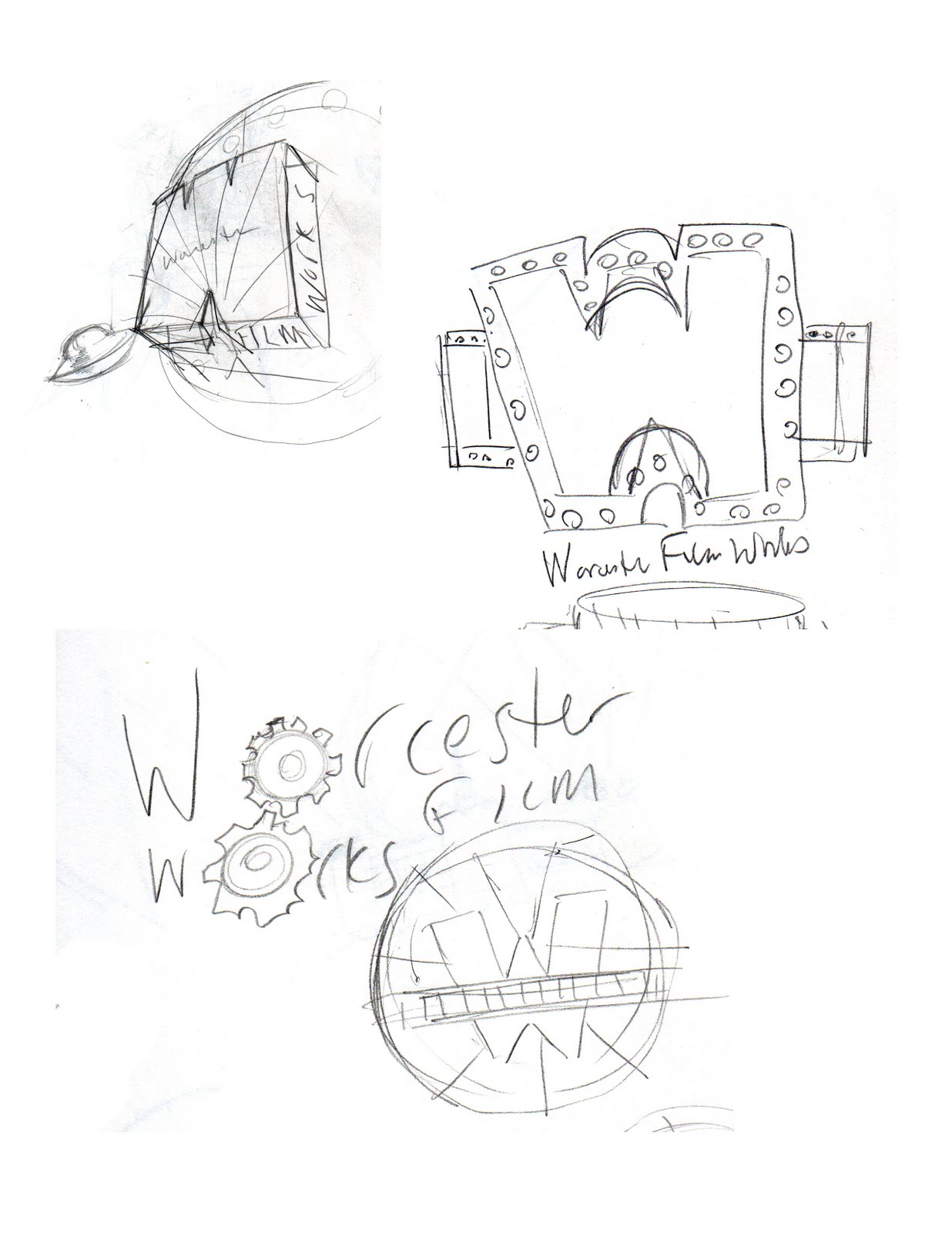
I was contacted recently about doing a logo for a local film project called Worcester Film Works. I completely misinterpreted the intention of the organization with the first round of sketches, assuming it was a local film company. The first attempt was pretty funny in a terrible way, I'd done a logo with a guy with a hammer and film reels and spotlights and stars and whatnot... In short, it came out looking like pure communist propaganda. Oops. Maybe I'll post it one day if I'm really desperate, but it's definitely nothing I'm proud of! After that, I did a little research and found out that the actual goal behind WFW is that they'll be SHOWING movies (free to the public) on Worcester Common... not MAKING them! Anywho, I did a bunch of sketches and threw as many movie inspired touches as I could think of. I boiled those down to what I thought were the few most fun ideas in this image:

And then had a little fun throwing it all together in this sketch:

... But then removed a lot of the clutter and just kept the simplified "W" made of film, and sent that off with a bunch of other interpretations in this grouping of logos:

I'd really meant for this to be more of a jumping off point to do some fun designs with, but in the end, they went for the WFW side-by-side letters. Oh well... it's a start!

If you're from Worcester, click the title of this post to check out their schedule for this summer.
I'm looking... forward... to Back To The Future!
-Mike




 It's the inked version of what I intend to use for the cover of an ongoing comic book project, "The Pale Dragon," the first issue of which will be on sale at the end of the month.
 And did I steal this layout from a movie poster or something? Someone call me on it. I recognize it's pretty cliché imagery, but still...


